01:00
The Good, The Bad, and The Ugly Ways of Representing Data
Talk at Harvey Mudd College
mdogucu.github.io/harvey-mudd-25
2025-03-29

North Circumpolar Region from the Dunhuang Star Chart circa 649-684 CE.
Recommended reading
Funkhouser, H. G. (1937). Historical Development of the Graphical Representation of Statistical Data. Osiris, 3, 269–404. Chapter 2 is on The Origin of the Graphic Method.
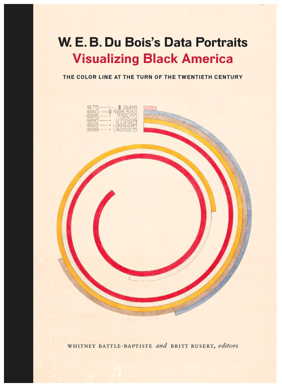
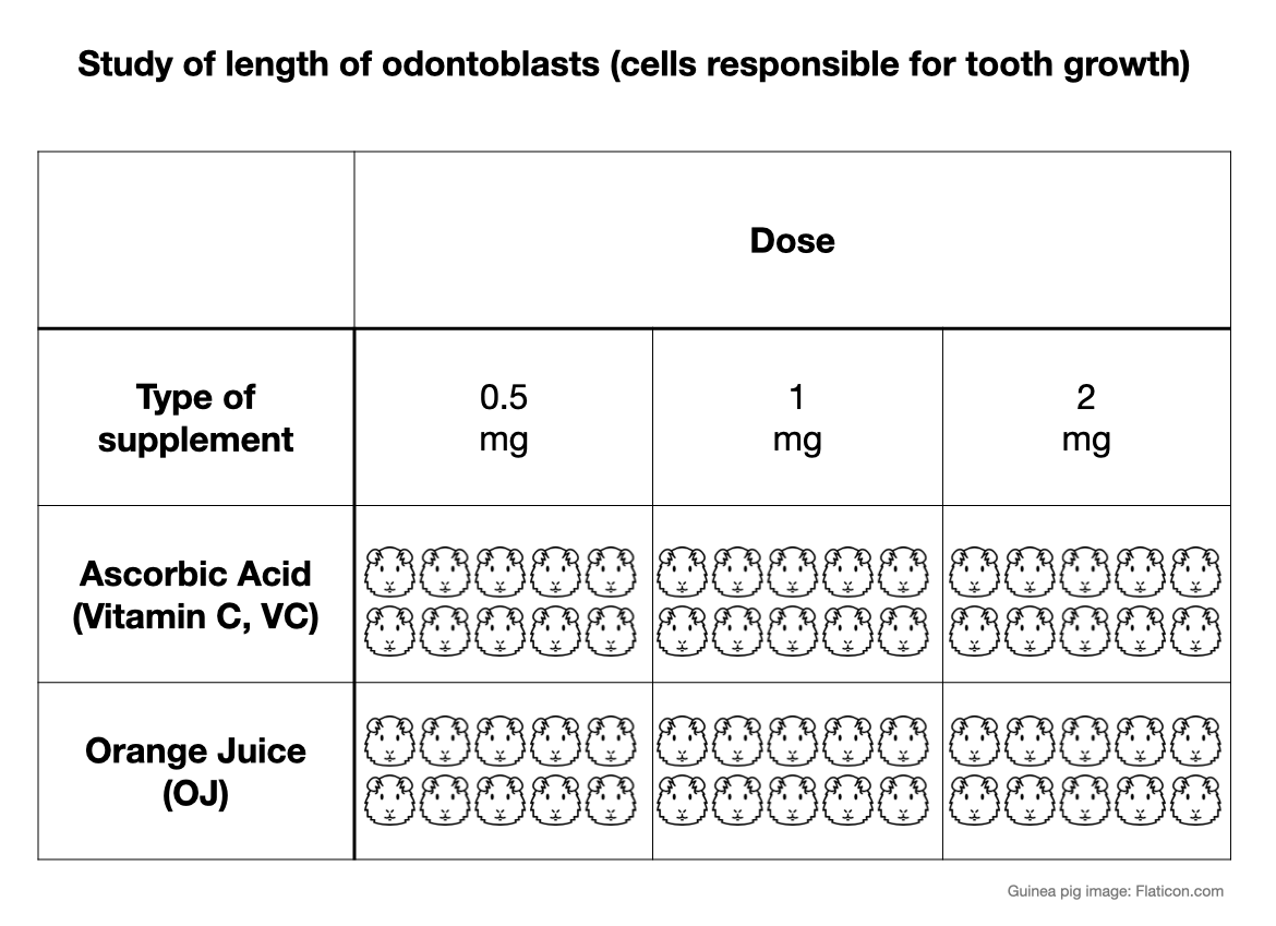
Assessed value of household and kitchen furniture owned by Black people in Georgia.

20th century navigational chart from Kwajalein Attoll, Marshall Islands, Micronesia on display at Bower Museum in Santa Ana. Photo by Mine Dogucu.
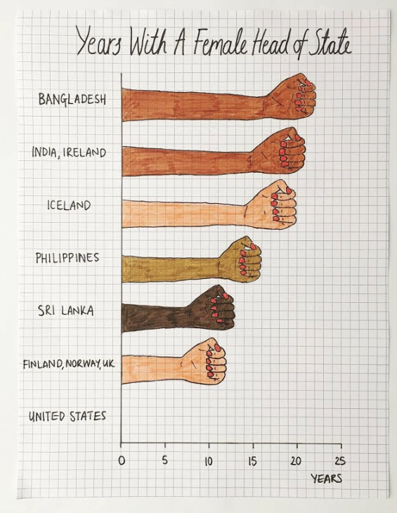
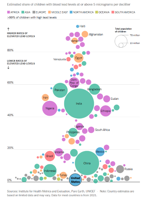
Visualization by Mona Chalabi.
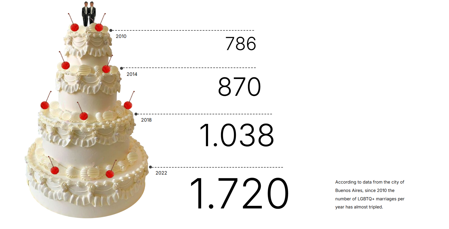
Same-sex marriages in Buenos Aires City by Macarena Zappe
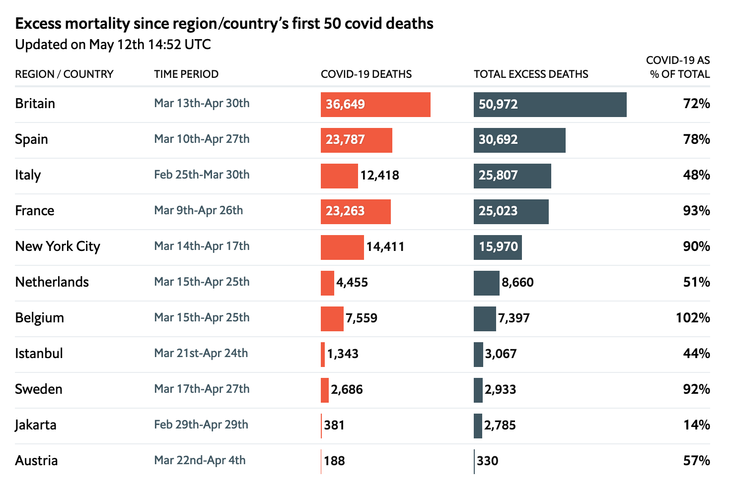
COVID related deaths table by the Economist
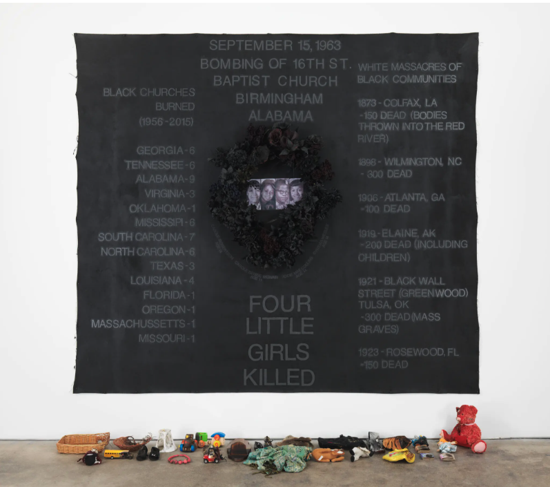
Howardena Pindell’s Four Litte Girls

LA Metro Rail map
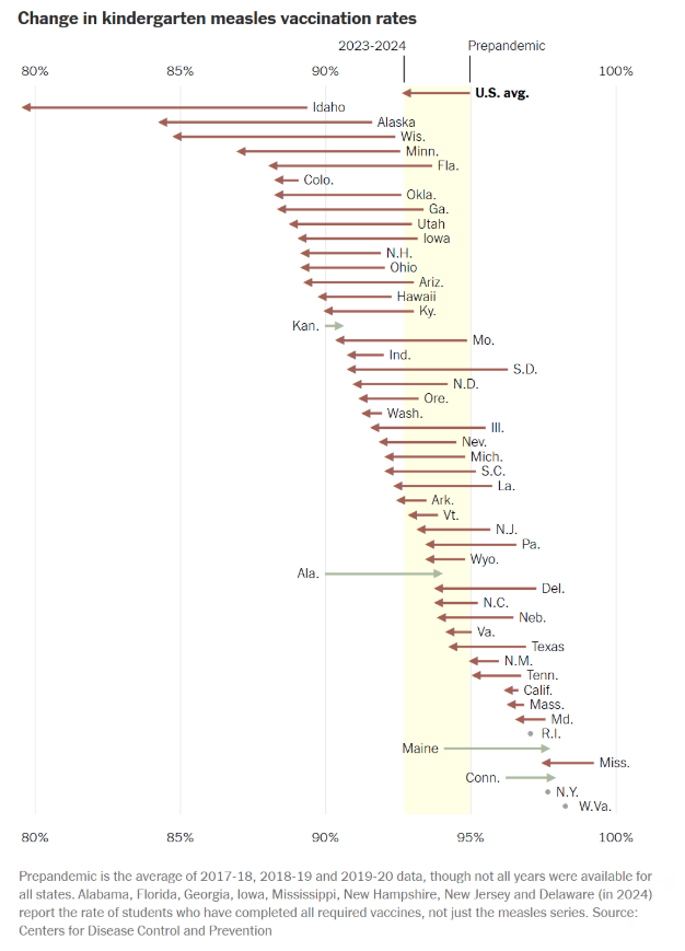
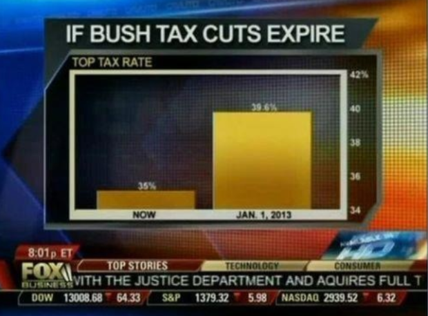
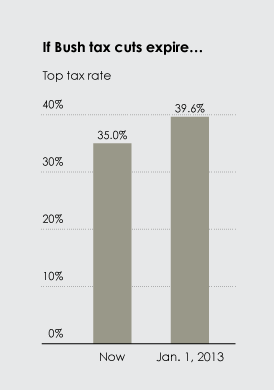
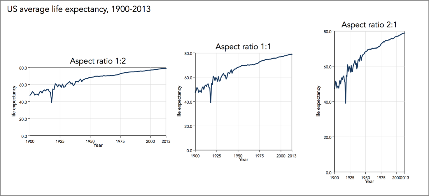
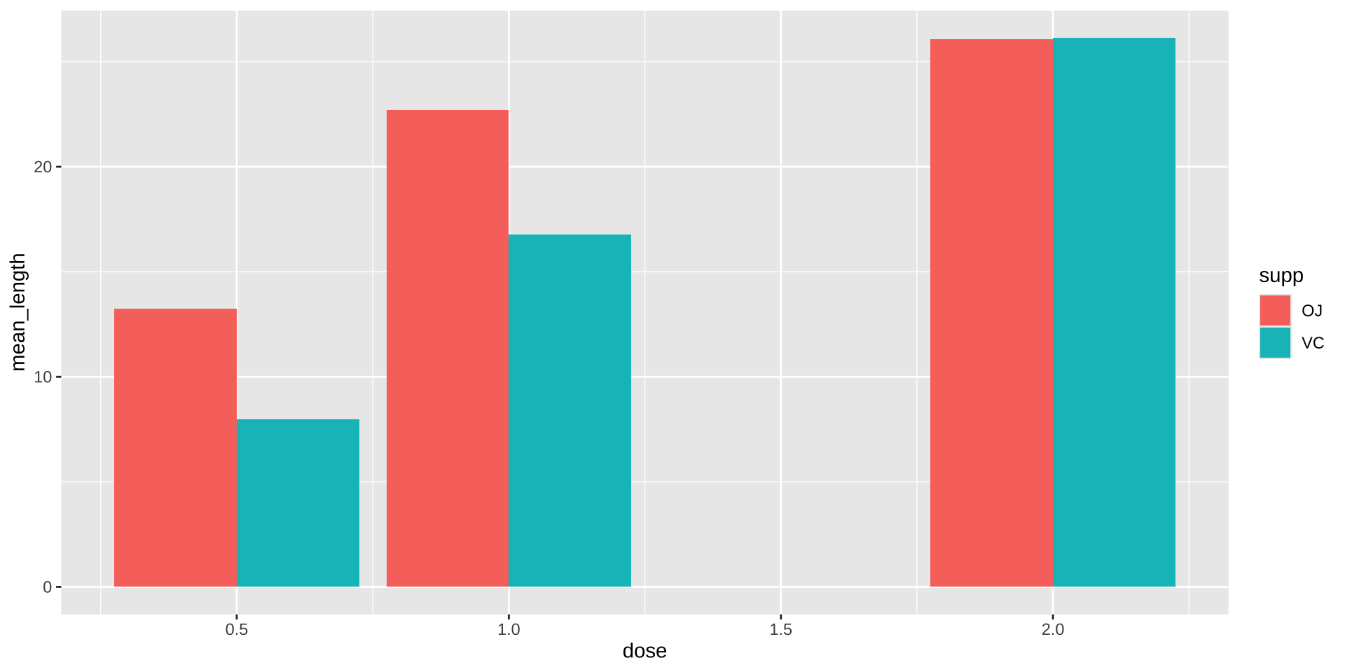
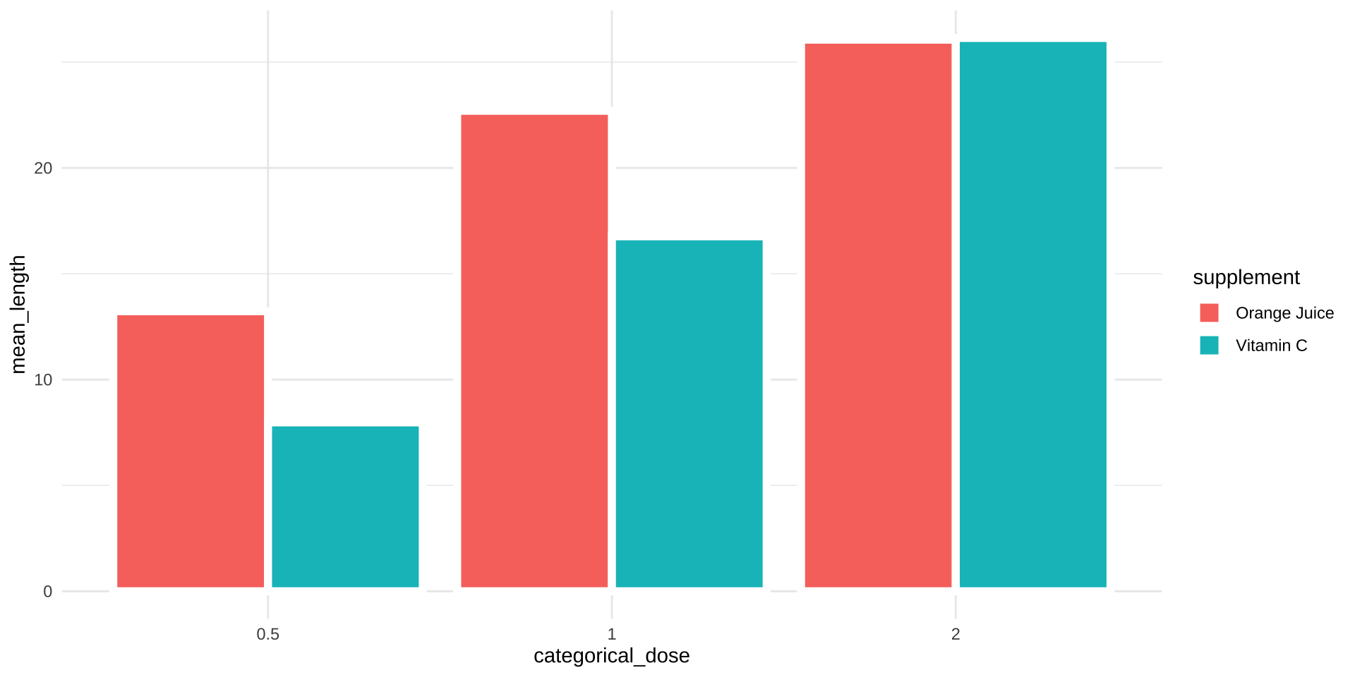
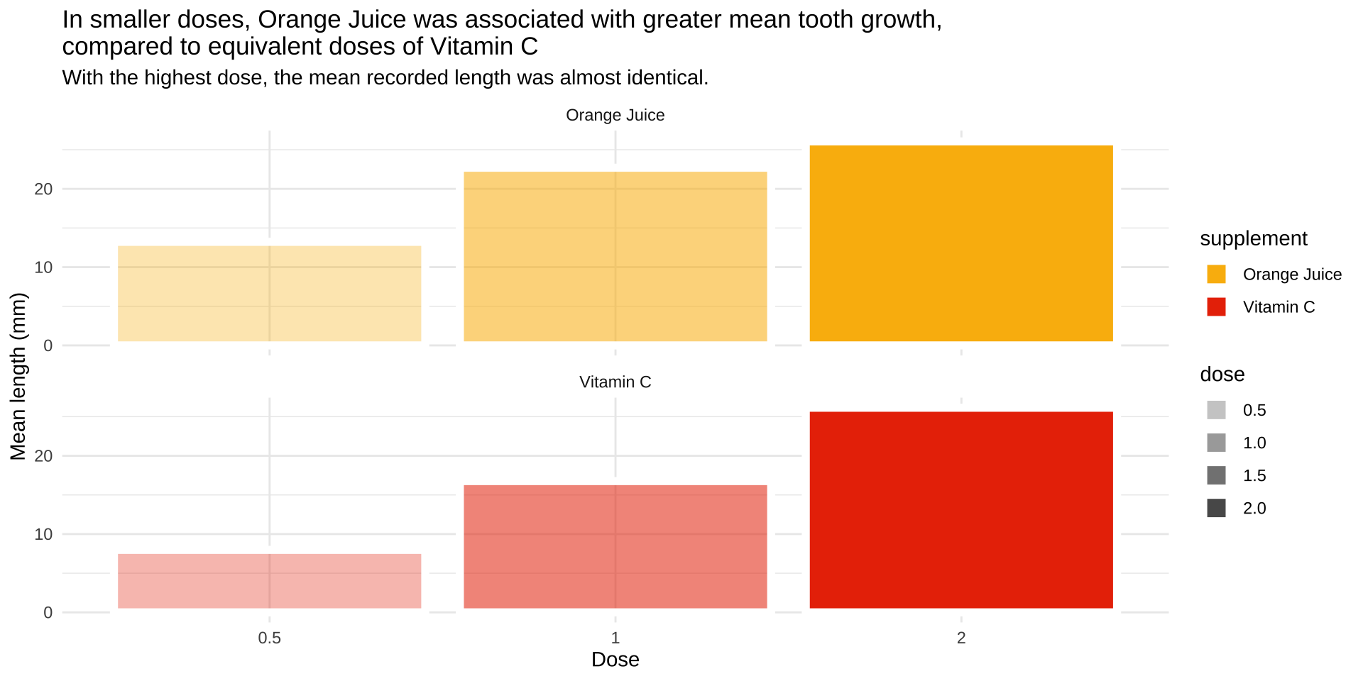
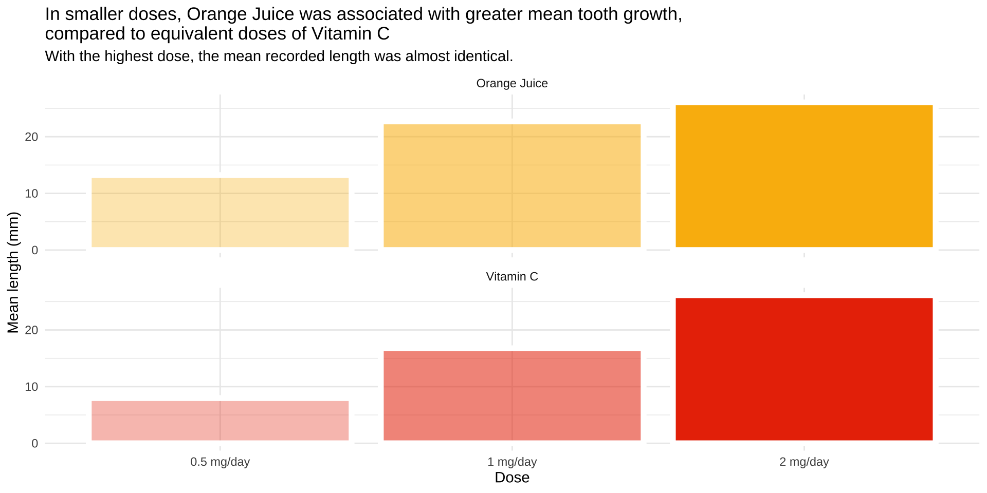
Truncated Axis
Tip
Whenever possible start the axis at zero.
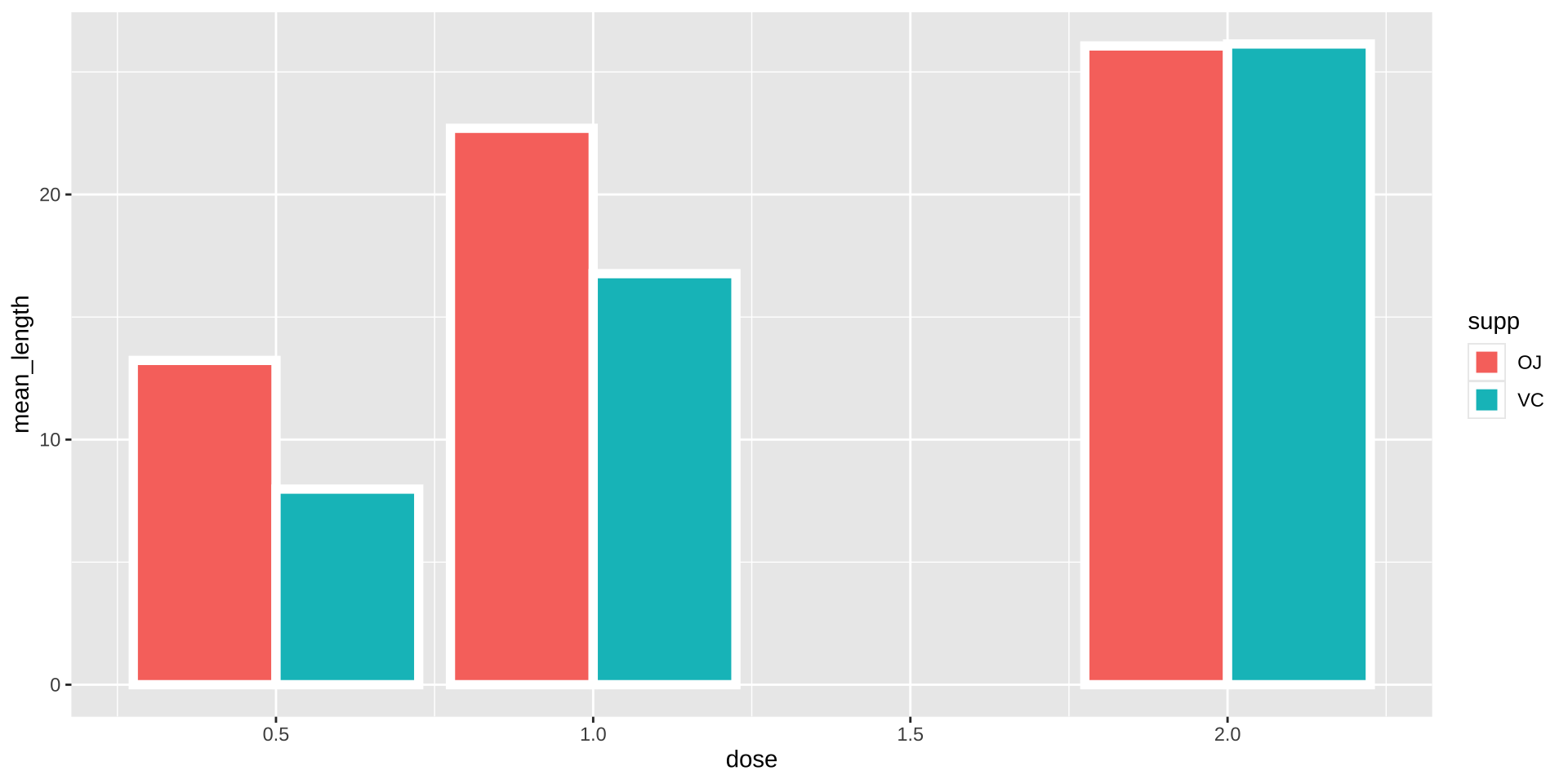
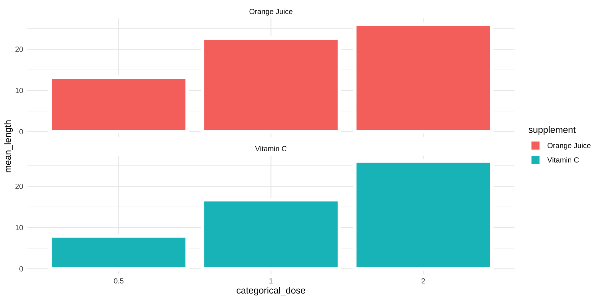
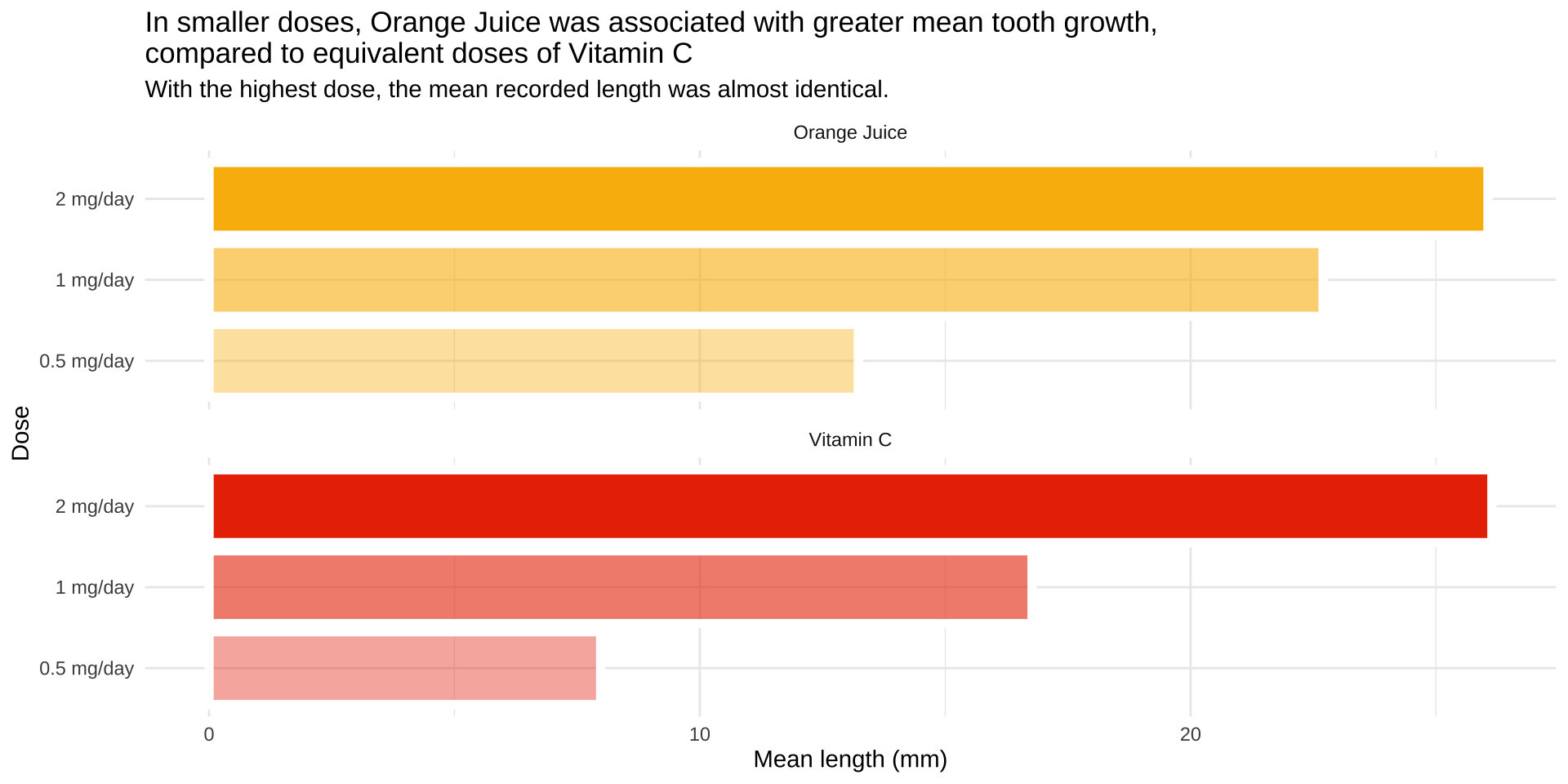
Aspect ratio
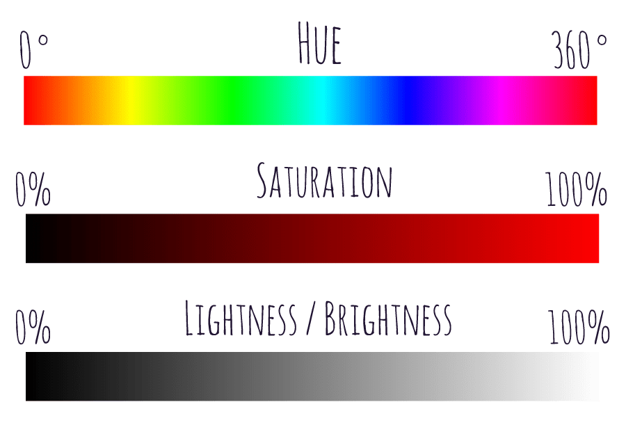
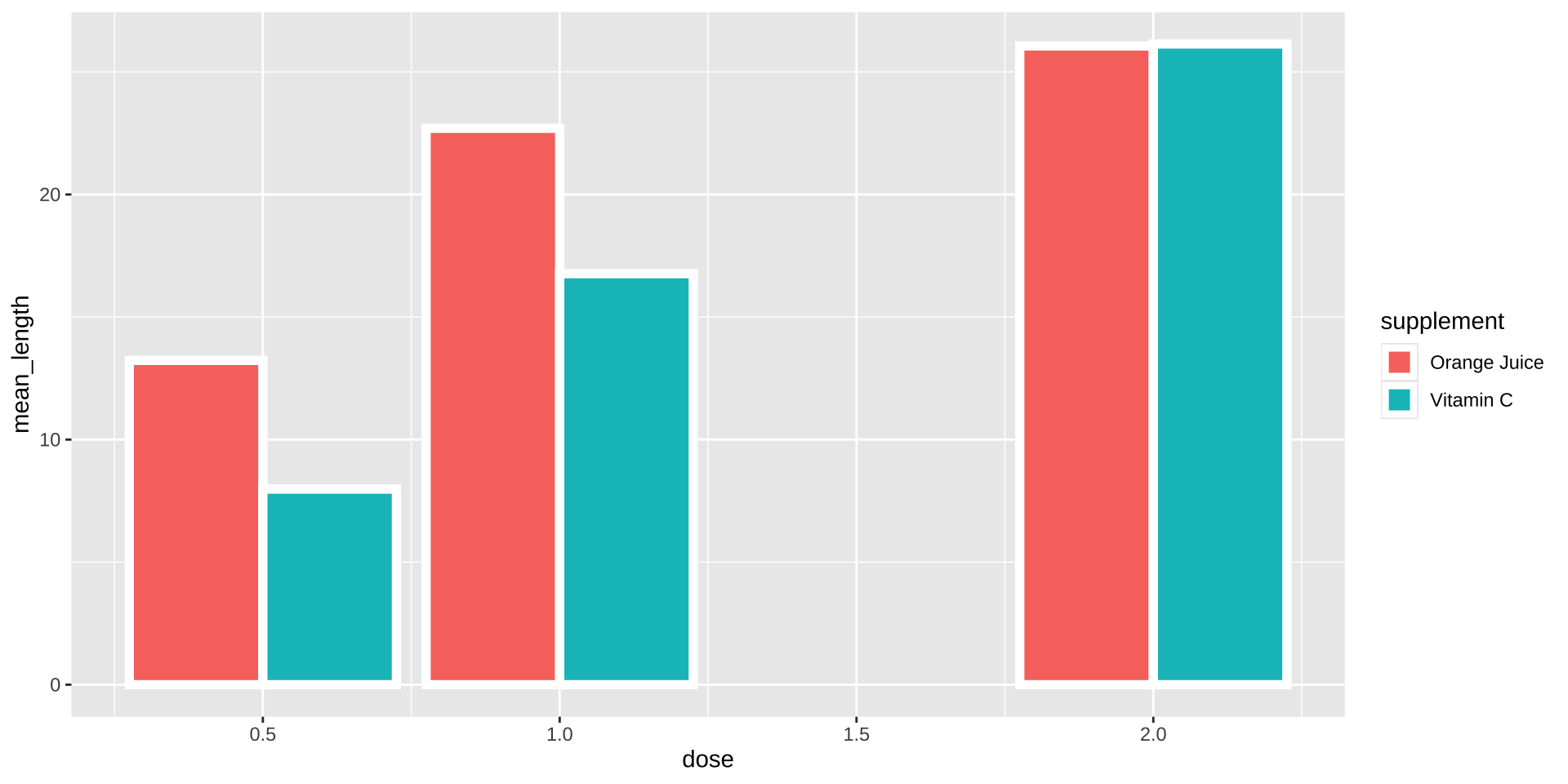
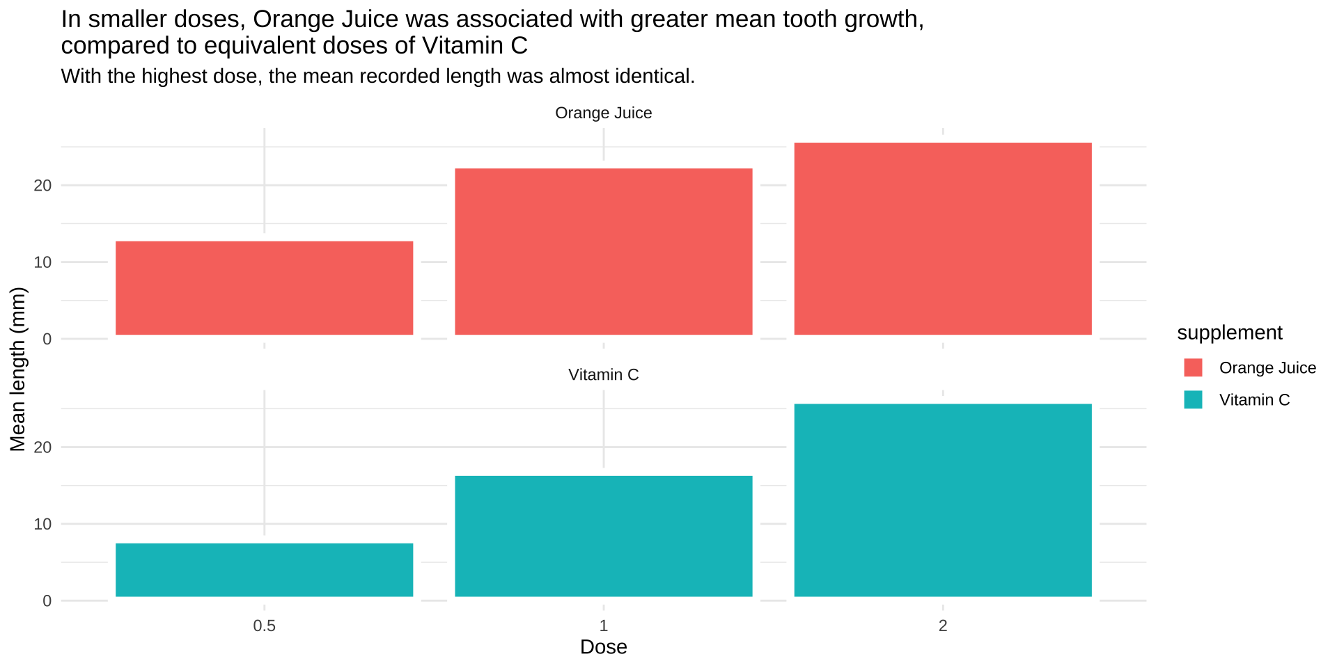
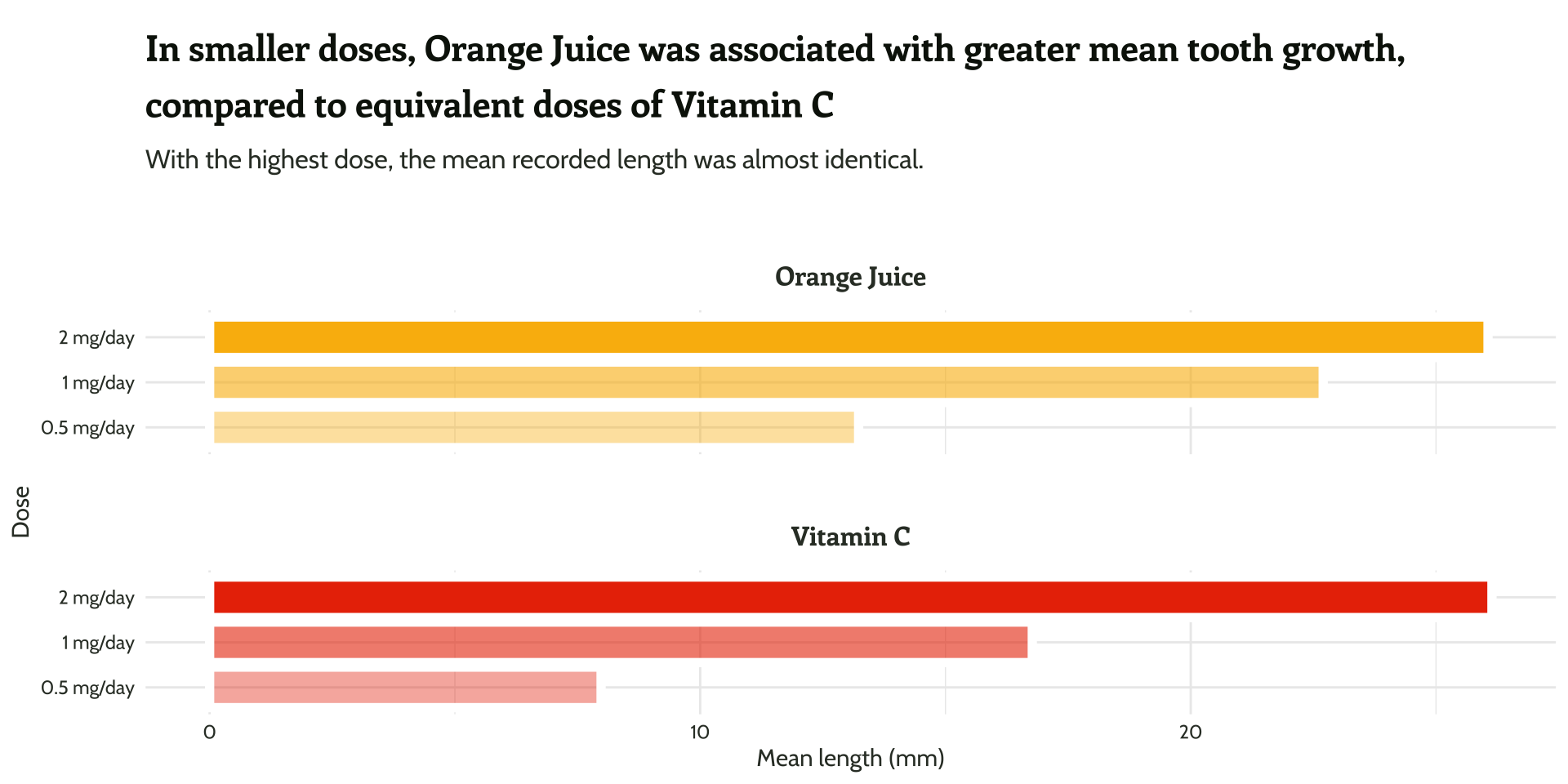
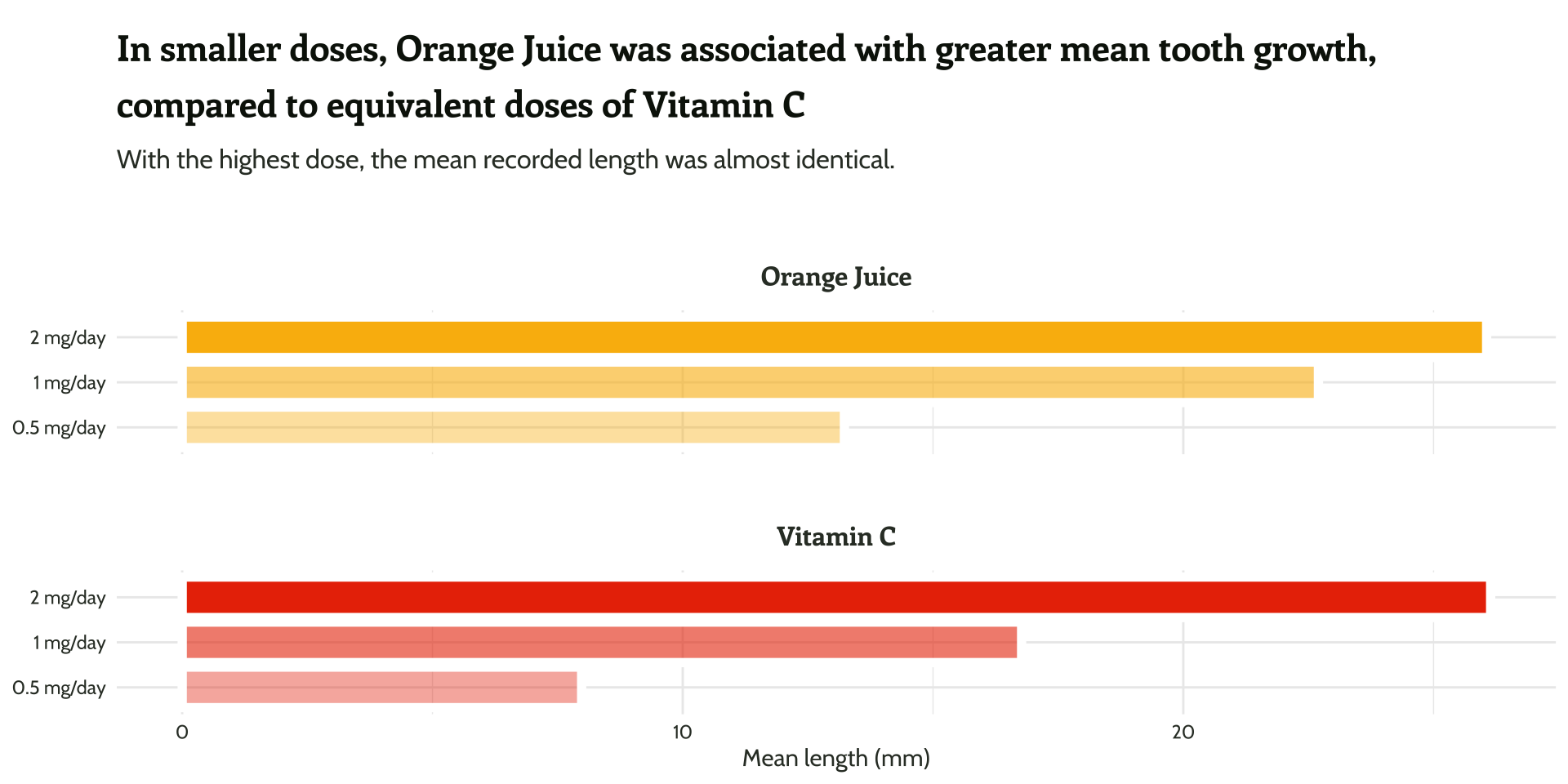
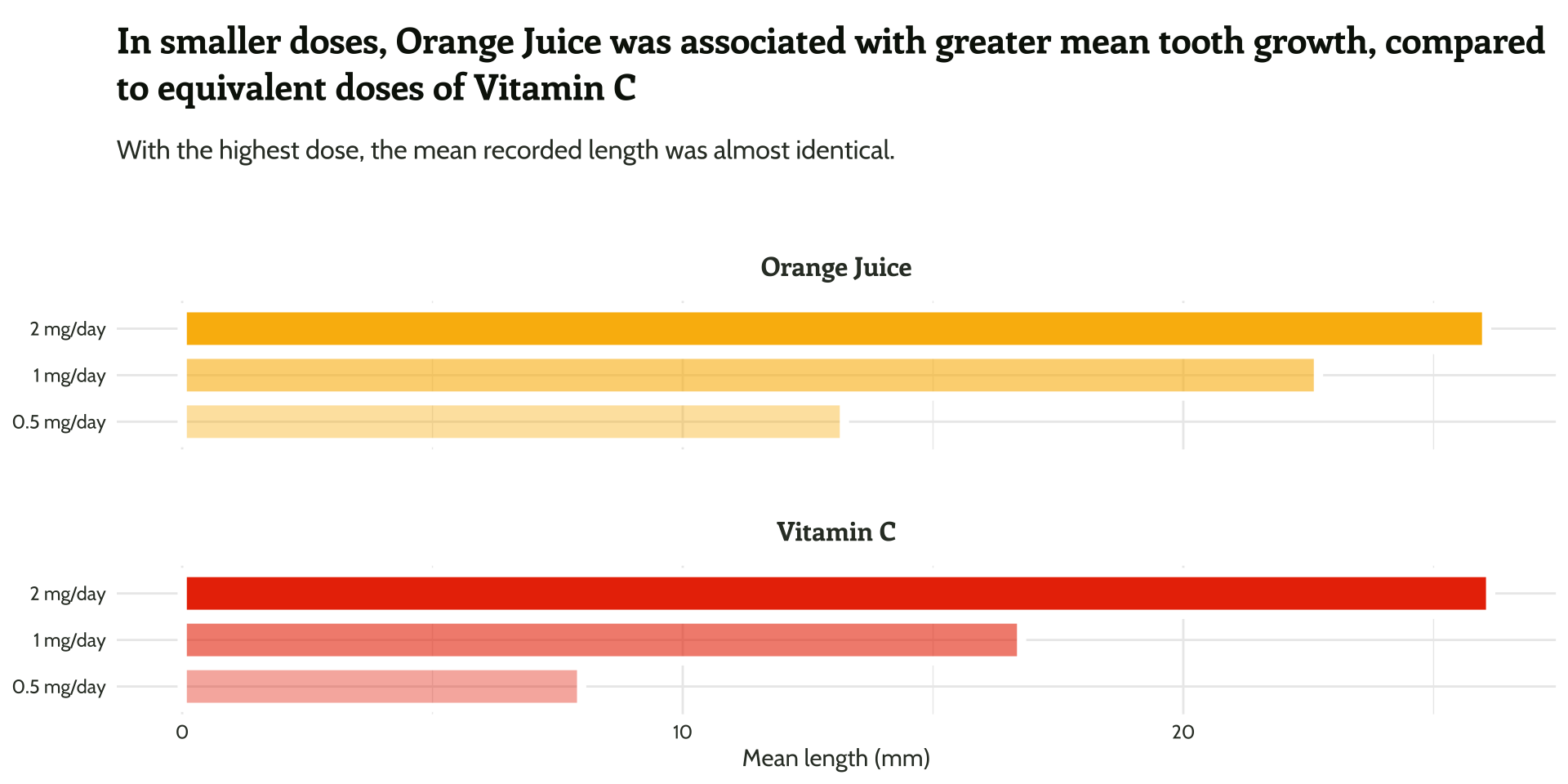
Color for grouping
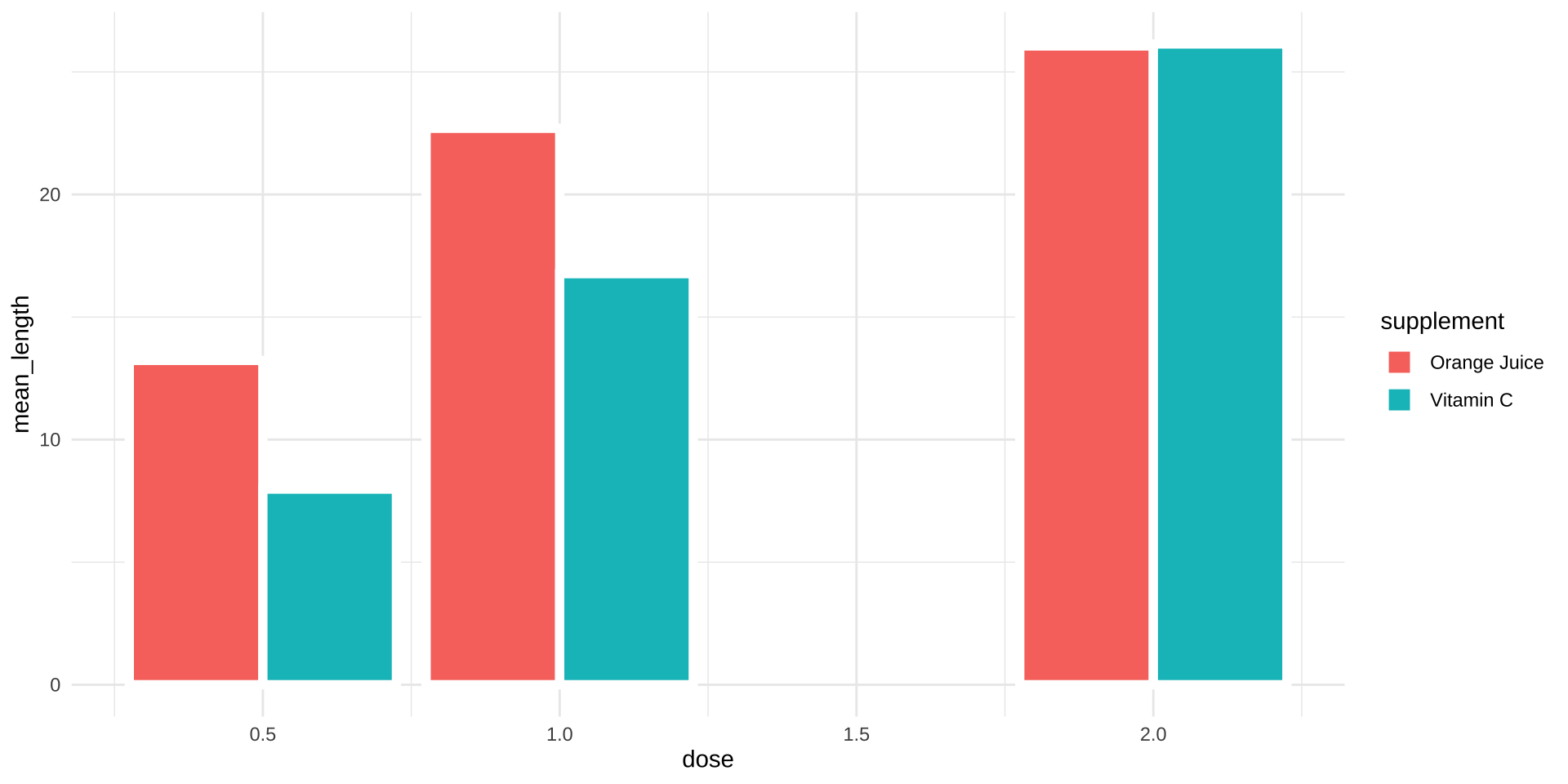
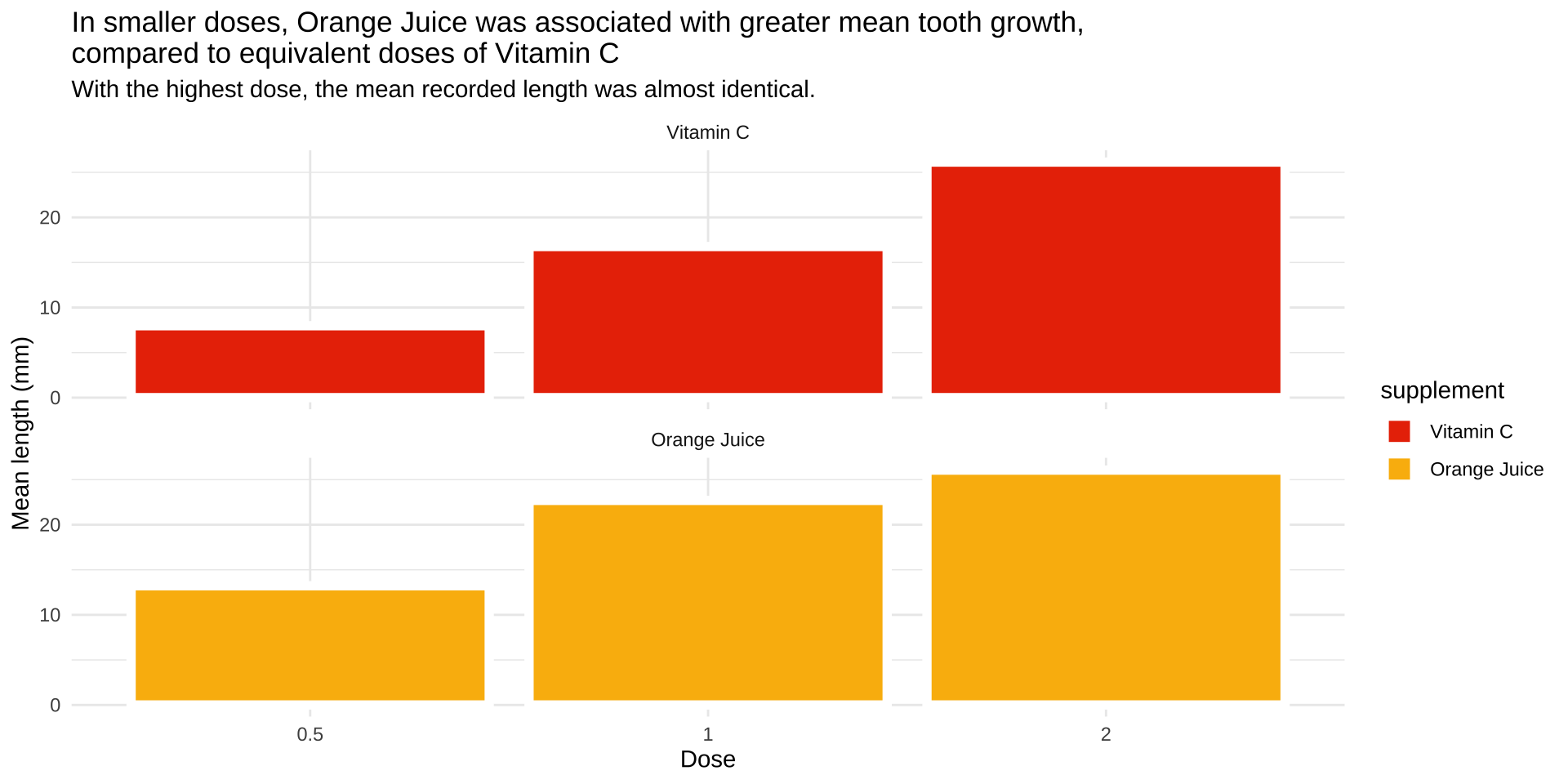
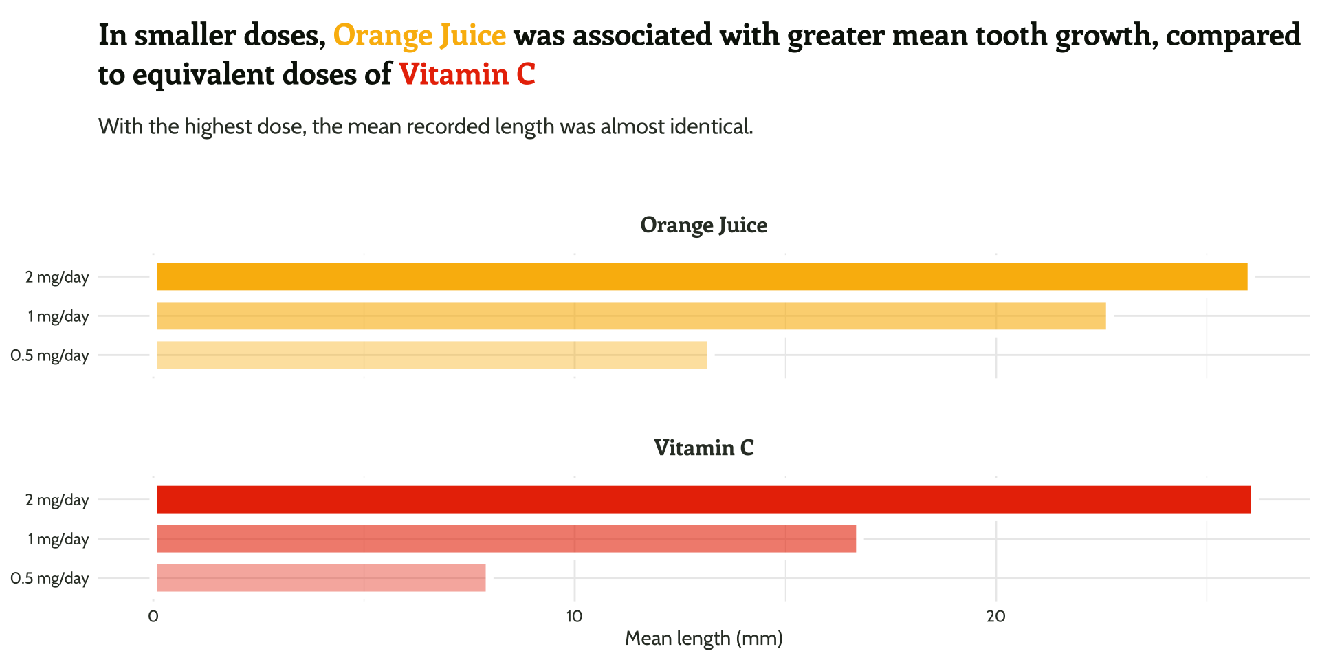
Color for representing numeric values
Color for emphasis
Color Theory
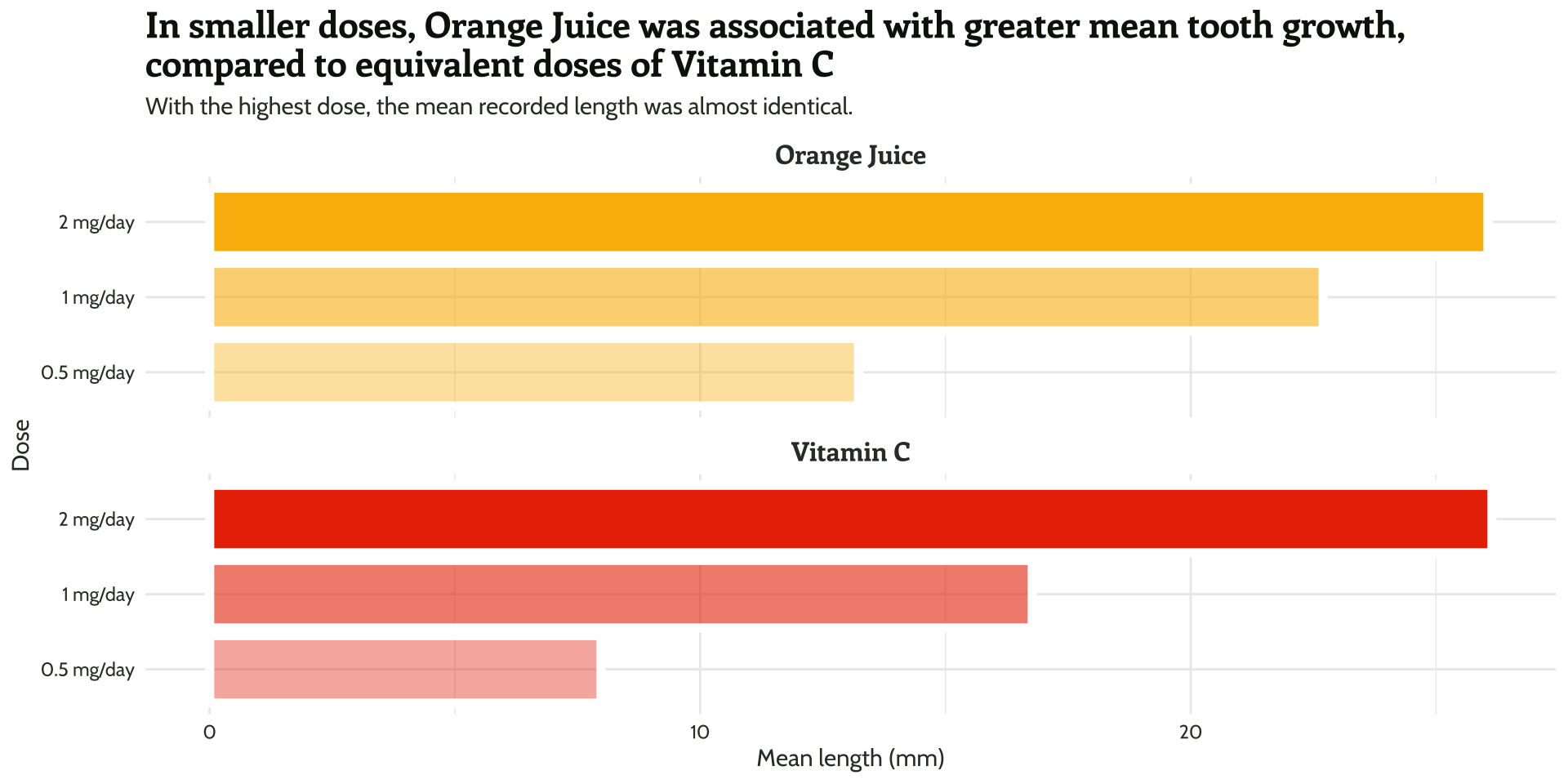
Fonts matter for clarity

Fonts matter for the message

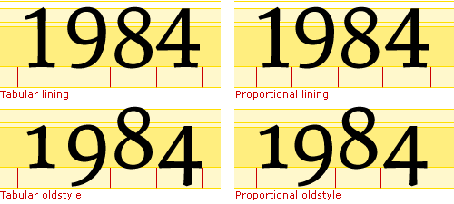
Tip
Use lining and tabular fonts for numbers.
Data context


Tip
Do not rely on software defaults for font size, font type, colors, labels, text alignment, legend, etc. without intention.

Since you are not a cat, for Datathon think outside the box PLEASE