class: center, middle, inverse, title-slide # Introduction to R the Tidy Way ## Data Visualization ### Mine Dogucu ### 2020-03-05 --- layout: true <!-- This file by Mine Dogucu is licensed under a Attribution-ShareAlike 2.5 Generic License (CC BY-SA 2.5) More information about the license can be found at https://creativecommons.org/licenses/by-sa/2.5/ --> <div class="my-header"></div> <div class="my-footer"> CC BY-SA <a href="https://mdogucu.ics.uci.edu">Mine Dogucu</a></div> --- class: center, middle ## License <img src="img/cc-sa.png" width="100%" /> More information can be found [here](https://creativecommons.org/licenses/by-sa/2.5/) --- class: center, middle ## Data Visualization What kind of data visuals do you make/use/would like to use? --- class: center, middle ## Data Visualization For data visualization in R we will be using the `ggplot()` function. --- ## Fun facts - `ggplot`'s gg stands for Grammar of Graphics. - Grammar of Graphics is a book by Leland Wilkenson. - The ggplot2 package is written by Hadley Wickham. He is a statistician who has changed the R world not only with the tools he built but also by actively participating in community building that is welcoming. --- If you wanted to make the following plot and R could understand English what would you tell R? Decide with your neighbor(s). <img src="2-visualization_files/figure-html/unnamed-chunk-3-1.png" style="display: block; margin: auto;" /> --- ## Three Steps of Making a basic ggplot - Make space for a plot using the dataset. - Decide on what goes on the axes. - Decide what kind of a plot. --- ## Step 1 - Make space for the plot .left-panel[ ```r ggplot(candy_rankings) ``` ] .right-panel[ <!-- --> ] --- ## Step 2 - Decide on variables and their axes .left-panel[ ```r ggplot(candy_rankings) + aes(x = chocolate) ``` ] .right-panel[ <!-- --> ] --- ## Step 3 - Decide on the type of plot .left-panel[ ```r ggplot(candy_rankings) + aes(x = chocolate) + geom_bar() ``` ] .right-panel[ <!-- --> ] --- 🗒Note that ggplots can be defined as an object and then recalled later. .left-panel[ ```r p_bar <- ggplot(candy_rankings) + aes(x = chocolate) + geom_bar() p_bar ``` ] .right-panel[ <!-- --> ] --- ## Practice ``` ## `stat_bin()` using `bins = 30`. Pick better value with `binwidth`. ``` <img src="2-visualization_files/figure-html/unnamed-chunk-12-1.png" style="display: block; margin: auto;" /> --- ## Error vs. Warning & Message 🔺 We have seen an error before. When you run into an __error__, R would not execute the code. ⚠️When you see __warning__ or a __message__. The code runs and returns a ggplot but also lets us know that something is going on. --- ## What is binwidth? Warnings and messages are mostly function specific and require some thinking (and possibly Googling) to figure things out. If bar plots have bars and they are called bar plots, technically histograms are bin plots because they have bins. The warning is basically warning us that by default, `geom_histogram()` displays 30 bins. It is asking us to set the binwidth. Where do you think the binwidth argument would go? --- ## Binwidth .left-panel[ ```r ggplot(candy_rankings) + aes(x = winpercent) + geom_histogram(binwidth = 3) ``` ] .right-panel[ <!-- --> ] --- class:middle ## Fun fact __histo__ comes from the Greek word _histos_ that literally means "anything set up right". __gram__: comes from the Greek word _gramma_ which means "that which is drawn". .footnote[Online Etymology Dictionary] --- class: center, middle ## Scatter plot aka geom_point() Can you make a plot showing a relationship between `pricepercent` and `winpercent`? Do the candies with higher `pricepercent` have higher `winpercent`? --- ## Scatter plot aka geom_point() .left-panel[ ```r ggplot(candy_rankings) + aes(x = pricepercent, y = winpercent) + geom_point() ``` ] .right-panel[ <!-- --> ] --- class: middle center ## Overview of geoms Depending on the types of variables (in Step 2) we decide on the geom type (Step 3). --- ## geom_bar() .left-panel[ <table> <tr> <th>x</th> <th>y</th> </tr> <tr> <td> categorical </td> <td>     </td> </tr> </table> <br> <br> ```r ggplot(candy_rankings) + aes(x = chocolate) + geom_bar() ``` ] .right-panel[ <!-- --> ] --- ## geom_histogram() .left-panel[ <table> <tr> <th>x</th> <th>y</th> </tr> <tr> <td> continuous </td> <td>    </td> </td> </tr> </table> <br> <br> ```r ggplot(candy_rankings) + aes(x = winpercent) + geom_histogram() ``` ] .right-panel[ <!-- --> ] --- ## geom_density() .left-panel[ <table> <tr> <th>x</th> <th>y</th> </tr> <tr> <td> continuous </td> <td>    </td> </td> </tr> </table> <br> <br> ```r ggplot(candy_rankings) + aes(x = winpercent) + geom_density() ``` ] .right-panel[ <!-- --> ] --- ## geom_dotplot() .left-panel[ <table> <tr> <th>x</th> <th>y</th> </tr> <tr> <td> continuous </td> <td>     </td> </td> </tr> </table> <br> <br> ```r ggplot(candy_rankings) + aes(x = winpercent) + geom_dotplot() ``` ] .right-panel[ <!-- --> ] --- ## geom_dotplot() .left-panel[ <table> <tr> <th>x</th> <th>y</th> </tr> <tr> <td> continuous </td> <td>     </td> </td> </tr> </table> <br> <br> ```r ggplot(candy_rankings) + aes(x = winpercent) + geom_dotplot(binwidth = 3) ``` ] .right-panel[ <!-- --> ] --- ## geom_boxplot() .left-panel[ <table> <tr> <th>x</th> <th>y</th> </tr> <tr> <td> categorical </td> <td> continuous </td> </td> </tr> </table> <br> <br> ```r ggplot(candy_rankings) + aes(x = chocolate, y = winpercent) + geom_boxplot() ``` ] .right-panel[ <!-- --> ] --- ## geom_point() .left-panel[ <table> <tr> <th>x</th> <th>y</th> </tr> <tr> <td> continuous </td> <td> continuous </td> </td> </tr> </table> <br> <br> ```r ggplot(candy_rankings) + aes(x = pricepercent, y = winpercent) + geom_point() ``` ] .right-panel[ <!-- --> ] --- class: middle center You can add layers on top of layers on top of layers on top of layers... --- ## geom_point() and geom_smooth() .left-panel[ <table> <tr> <th>x</th> <th>y</th> </tr> <tr> <td> continuous </td> <td> continuous </td> </td> </tr> </table> <br> <br> ```r ggplot(candy_rankings) + aes(x = pricepercent, y = winpercent) + geom_point() + geom_smooth() ``` ] .right-panel[ 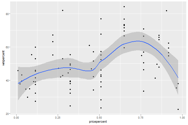<!-- --> ] --- ## geom_point() and geom_smooth() .left-panel[ <table> <tr> <th>x</th> <th>y</th> </tr> <tr> <td> continuous </td> <td> continuous </td> </td> </tr> </table> We can set the smoothing method to be _lm_ (linear model). ```r ggplot(candy_rankings) + aes(x = pricepercent, y = winpercent) + geom_point() + geom_smooth(method = "lm") ``` ] .right-panel[ 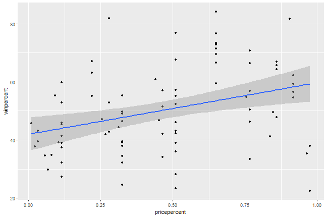<!-- --> ] --- ## geom_point() and geom_smooth() .left-panel[ <table> <tr> <th>x</th> <th>y</th> </tr> <tr> <td> continuous </td> <td> continuous </td> </td> </tr> </table> We can set _se_ (standard error) to FALSE ```r ggplot(candy_rankings) + aes(x = pricepercent, y = winpercent) + geom_point() + geom_smooth(method = "lm", se = FALSE) ``` ] .right-panel[ 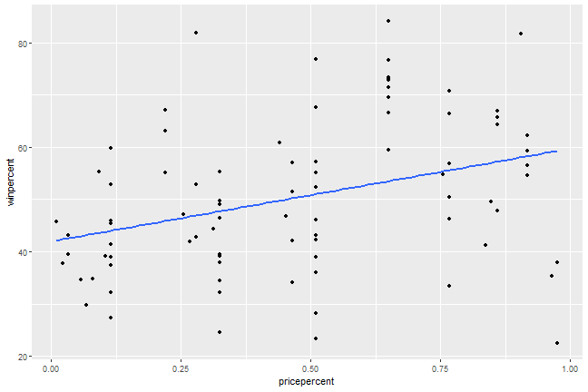<!-- --> ] --- ## Practice <img src="2-visualization_files/figure-html/unnamed-chunk-37-1.png" style="display: block; margin: auto;" /> --- ## Practice Do the candies with higher `sugarpercent` have higher `winpercent`? Plot this relationship. --- class: center middle ## Colors .large[ 🌈 ] Pick your favorite color(s) from the list at: [bit.ly/colors-r](http:/bit.ly/colors-r) --- # color = ? .left-panel[ ```r ggplot(candy_rankings) + aes(x = chocolate) + geom_bar(color = 'darkblue') ``` ] .right-panel[ 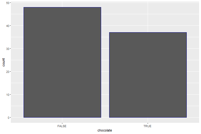<!-- --> ] --- # fill = ? .left-panel[ ```r ggplot(candy_rankings) + aes(x = chocolate) + geom_bar(color = 'darkblue', fill = 'coral') ``` ] .right-panel[ 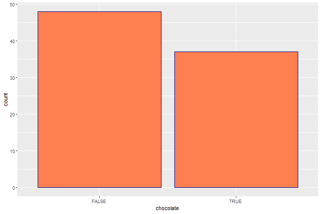<!-- --> ] --- # fill = ? .left-panel[ The fill argument can also be used for a variable. Note that this time fill is inside the `aes` function with the other variable. The colors are set by default. ```r ggplot(candy_rankings) + aes(x = chocolate, fill = fruity) + geom_bar() ``` ] .right-panel[ 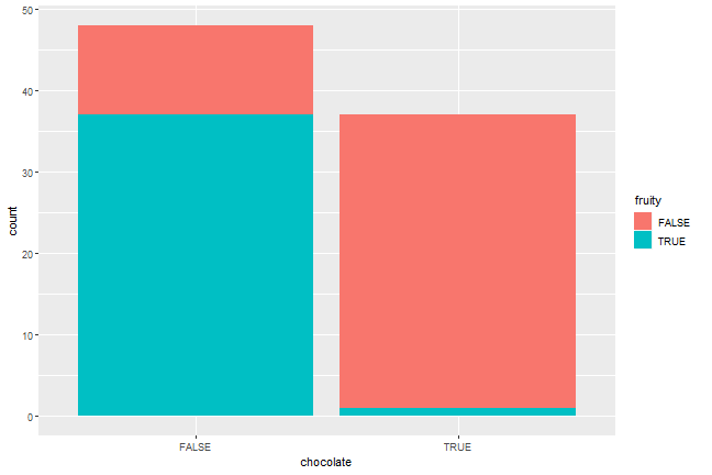<!-- --> ] --- class: center, middle ## Shapes [bit.ly/shapes-r](http:/bit.ly/shapes-r) --- ## Shapes .left-panel[ ```r ggplot(candy_rankings) + aes(x = pricepercent, y = winpercent) + geom_point(shape = 2) ``` ] .right-panel[ <!-- --> ] --- ## Practice <img src="2-visualization_files/figure-html/unnamed-chunk-46-1.png" style="display: block; margin: auto;" /> --- #labs .left-panel[ ```r ggplot(candy_rankings) + aes(x = sugarpercent, y = winpercent) + geom_point() + labs(x = "Sugar Percentage", y = "Win Percentage", title = "Relationship between the dependent and independent variable", subtitle = "for Halloween candies", caption = "Based on an online Survey by FiveThirtyEight") ``` ] .right-panel[ 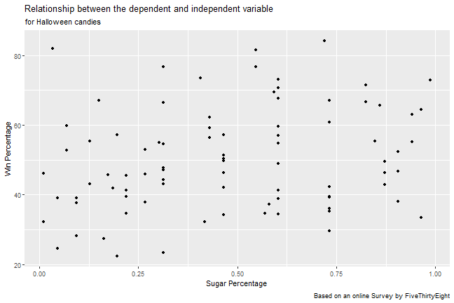<!-- --> ] --- #lim .left-panel[ ```r ggplot(candy_rankings) + aes(x = sugarpercent, y = winpercent) + geom_point() + xlim(0, 1) + ylim(0, 100) ``` ] .right-panel[ 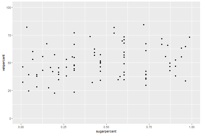<!-- --> ] --- class: center middle ## New Data `babies` --- ## Practice Make visuals that could provide some insight about the following questions. - Does the distribution of baby weights (`bwt`) look normal? - Is there a difference (at least visually) in baby weights (`bwt`) based on whether the mother smokes (`smoke`) or not? - Does the relationship between baby weights (`bwt`) and gestation period (`gestation`) seem linear? Note that this dataset has `NA` values which indicate missing values. --- class: center middle ## Facets --- .left-panel[ ```r ggplot(babies) + aes(x = gestation, y = bwt) + geom_point() + facet_grid(.~smoke) ``` ] .right-panel[ ``` ## Warning: Removed 13 rows containing missing values (geom_point). ``` 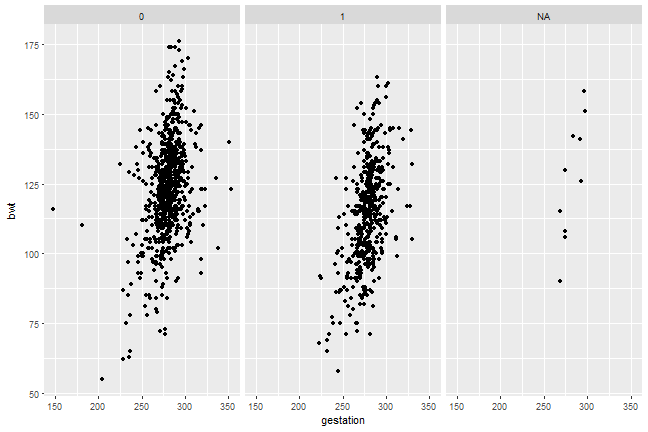<!-- --> ] --- .left-panel[ ```r ggplot(babies) + aes(x = gestation, y = bwt) + geom_point() + facet_grid(smoke~.) ``` ] .right-panel[ ``` ## Warning: Removed 13 rows containing missing values (geom_point). ``` 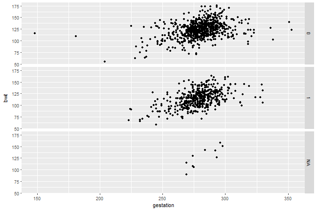<!-- --> ] --- class: center middle ## Equations y ~ x --- ## Problems Even though we could facet the plots, the data is problematic - There are `NA` values. - `smoke` is coded as 0 and 1 and would possibly looks better if it said `smoker` and `non-smoker`. Good thing we will learn how to wrangle data. --- ## Side Note We have used `+` to add layers to the ggplot. This is the only time we will use `+` other than using it for addition operation. --- ## Side Note If you provide the arguments in the order R expects them then you do not need to specify the arguments. Both of these sets of code would work the same. .pull-left[ ```r ggplot(candy_rankings) + * aes(x = chocolate, * y = winpercent) + geom_boxplot() ``` ] .pull-right[ ```r ggplot(candy_rankings) + * aes(chocolate, * winpercent) + geom_boxplot() ``` ] --- ## Fun fact - [BBC](https://bbc.github.io/rcookbook/), [fivethirtyeight](https://rdrr.io/cran/ggthemes/man/theme_fivethirtyeight.html), [Associated Press](https://github.com/associatedpress/apstyle), and many others use ggplot2. --- class: center middle [RStudio Cheat Sheets](https://rstudio.com/resources/cheatsheets/) --- ## Schedule for the Day __08:45 - 09:00 Introduction__ __09:00 - 09:15 Getting to Know the Basics__ __09:15 - 10:15 Data Visualization__ 10:15 - 10:30 Break 10:30 - 12:00 Data Wrangling 12:00 - 01:00 Lunch 01:00 - 01:30 Working Locally With R 01:30 - 02:00 Dealing with Datasets 02:00 - 02:30 Case Study 02:30 - 02:45 Break 02:45 - 03:30 Modeling 03:30 - 04:00 Everything I did not have time to cover