Teaching Accessibly and Teaching Accessibility in Data-Intensive Courses
Talk at the Department of Statistics in University of Washington
Mine Dogucu University of California Irvine
2025-05-02
👩🏫 My Background
📍 Teaching in the Department of Statistics, University of California, Irvine (since July 2019) — with a one-year detour at University College London
🏫 The Department is in the Donald Bren School of Information & Computer Sciences (ICS)
📊 I mostly teach (with) R
Some statistics from the tech world
Meta (2022):
Technical roles: Hispanic employees 4.8%, Black employees 2.4%, Women 25.8%
Google (US - 2023):
Technical roles: Black women 1.2%, Latina women 1.3%, Native American women 0.2%
Google (Global - 2023):
Employees with a disability (reported): 6.5% (vs. WHO estimate: 16%)
Some Problems with Tech Tools
Statistical Translation Tools: (e.g., Google Translate) frequently default to male pronouns (Prates et al., 2019).
Facial Recognition Algorithms: Show significantly lower accuracy for women compared to men, and for darker-skinned individuals compared to lighter-skinned individuals (Raji and Buolamwini, 2019).
Autonomous Vehicles: Fail to recognize the behaviors of people with disabilities (Disability Rights UK, 2021).
We must design accessible and inclusive data-intensive courses to prepare a future data workforce that is diverse.
Financial Burden of Learning Materials: In 2021, students at four-year universities faced an estimated annual cost of $1240 for books and supplies (Hanson, 2021).
Trade-offs for Affordability: Approximately 11% of students indicated making sacrifices by skipping meals to afford necessary course materials (Hanson, 2021).
Global Access and Reach: The website, bayesrulesbook.com, demonstrates the widespread impact of freely available educational materials, having been accessed from over 150 countries.
Assistive Technology
Assistive Technology (AT) refers to any form of technology (software, device) that helps people with disabilities perform specific activities.
Examples of Assistive Technology:
Walking sticks
Wheelchairs
Screen readers, an assistive technology specifically designed to support blind or visually impaired individuals in using their computers.
The video shows use of a screen reader briefly.
Alternate Text
“Alt text” (alternative text) provides a textual description of the content within an image.
It is a fundamental attribute used in HTML pages and other software.
Screen readers, assistive technologies for visually impaired users, cannot interpret images directly. However, they can read the provided alt text, making visual content accessible.
Therefore, providing descriptive alt text is essential for inclusive web content.
Rethinking Math Accessibility
The Calculus Barrier: Should calculus truly be a prerequisite for all?
Beyond Passive Learning: How can we actively engage students/readers and check their understanding with built-in quizzes?
Math with Computing: What if we used the power of computing to illustrate and solidify abstract mathematical concepts?
Making learning fun
How can we live if we don’t change? —Beyoncé. Lyric from “Satellites.”
vs.
What is probability?
Embracing mistakes as part of learning
As you read the book and put Bayesian methodology into practice, you will make mistakes. Many mistakes. Making and learning from mistakes is simply part of learning. We hope that you persist through the struggle of learning so that you can contribute your unique insights, perspectives, and experiences to the Bayesian community.
v.s.
The proof is obvious.
Making learning relevant with diverse set of applications
Weather
LGBTQ+ anti-discrimination laws
Spotify data
Hotel bookings
Penguins
Teaching Accessibility
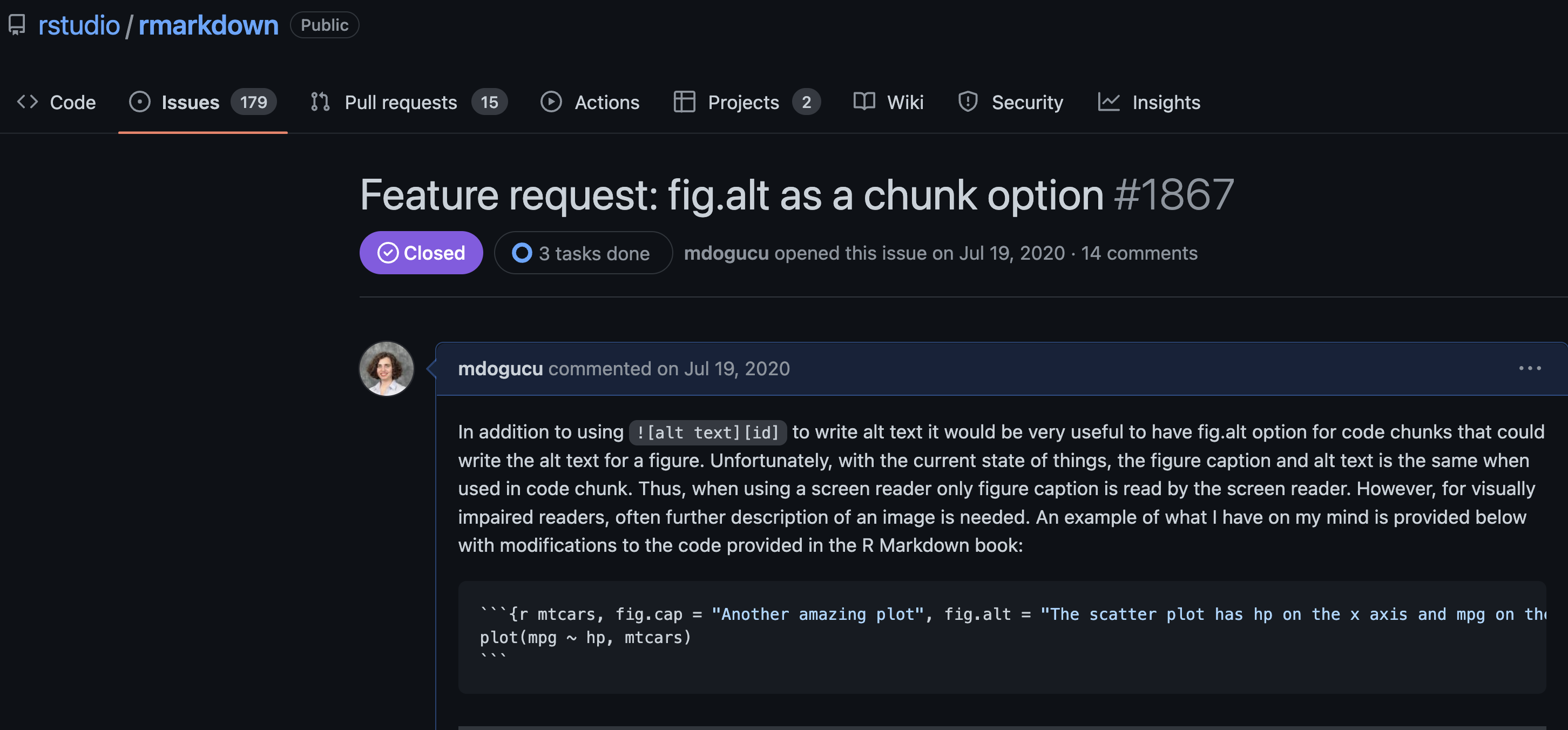
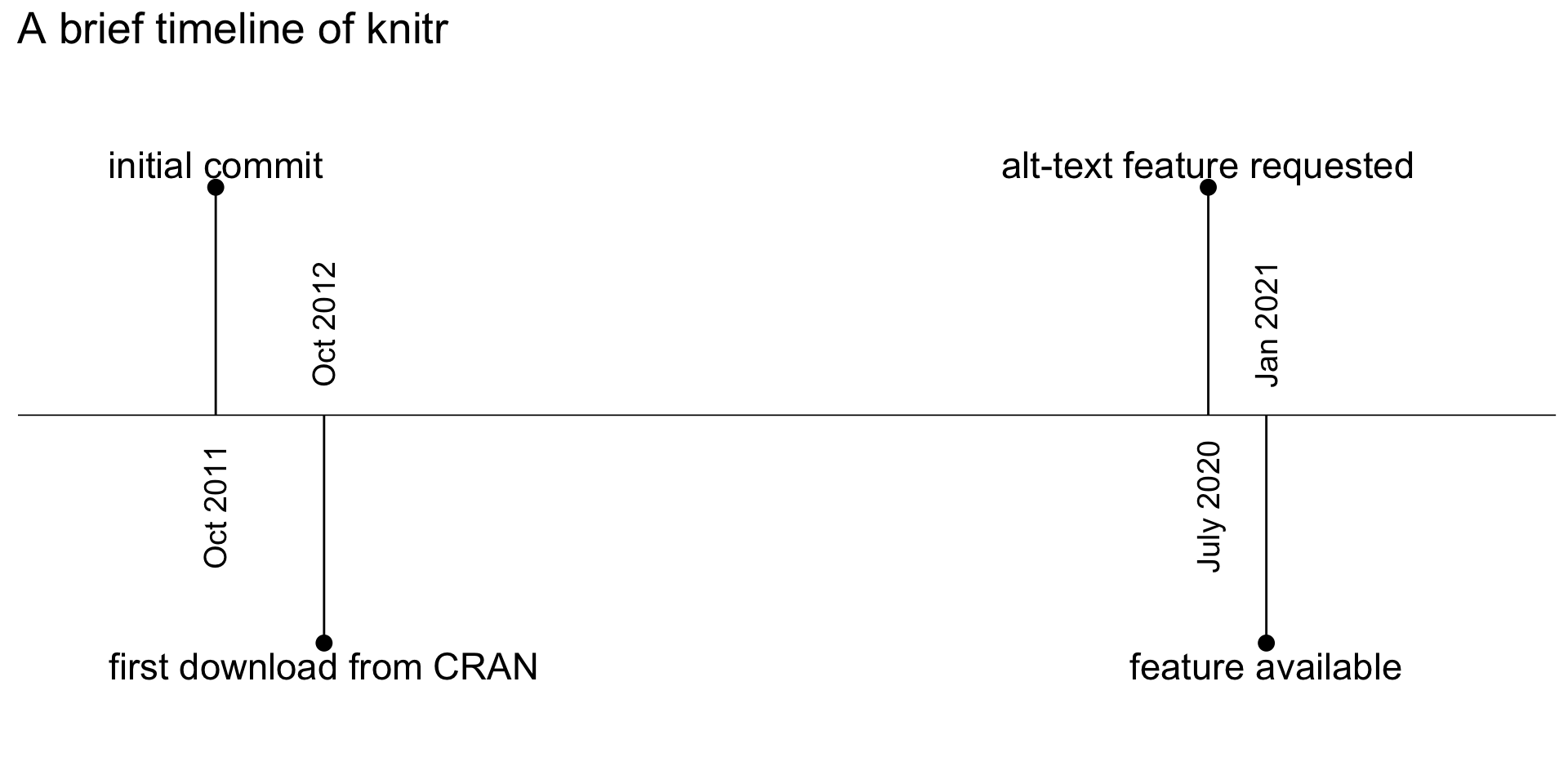
Between first CRAN download and alt-text feature request, there were 22,622,426 CRAN downloads of knitr.
It took Posit (née RStudio) 187 days to provide the feature.
Developers Create Tools with no Accessibility Support
Data Scientists Create Inacessible Products
Curriculum Does Not Teach Accessibility
Developers Create Tools with no Accessibility Support
Any opinions, findings, and conclusions or recommendations expressed in this material are those of the author(s) and do not necessarily reflect the views of the National Science Foundation.
JooYoung Seo
University of Illinois Urbana-Champaign
Our Curriculum Goal: Building Accessible Data Science
How can we, as educators, empower both current and future data scientists to create public-facing outputs – websites, analyses, reports – that are truly accessible to everyone?
This is our core mission: to cultivate a generation of data professionals who prioritize inclusivity in their communication, ensuring that valuable insights reach the broadest possible audience.
Learning Objectives
Students will:
Become familiar with the Americans with Disabilities Act (ADA) and/or the United Nations Convention on the Rights of Persons with Disabilities.
Gain Practical Experience: Utilize at least one assistive technology such as a screen reader to understand its functionality and user experience.
Develop Inclusive Design Thinking: Critically consider and implement different representations of data.
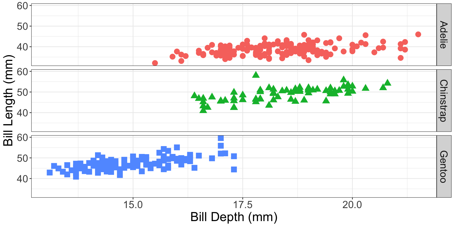
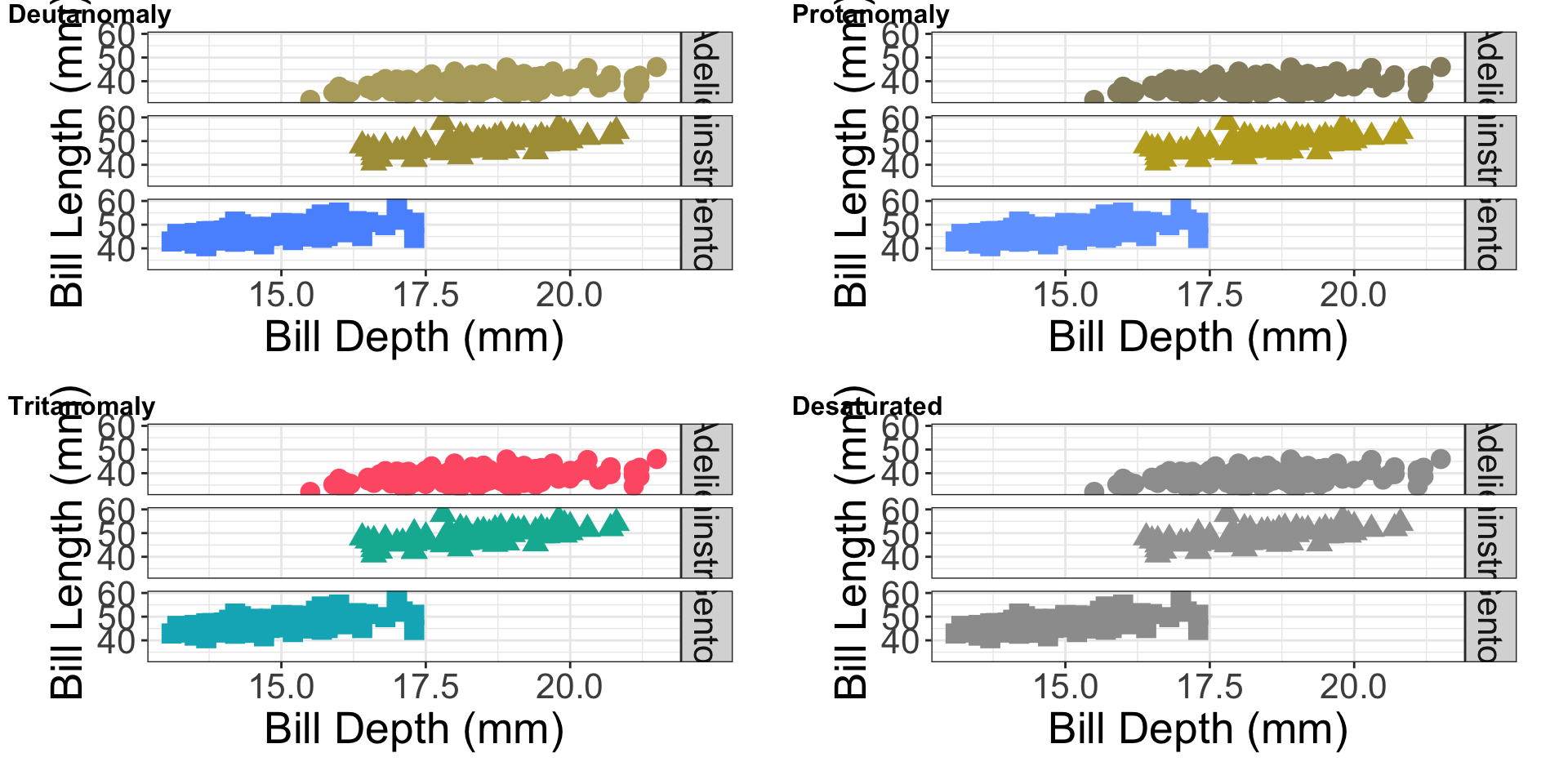
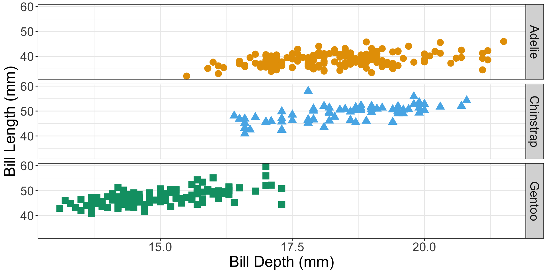
Data Visualization - Colors
Color Blindness Simulator
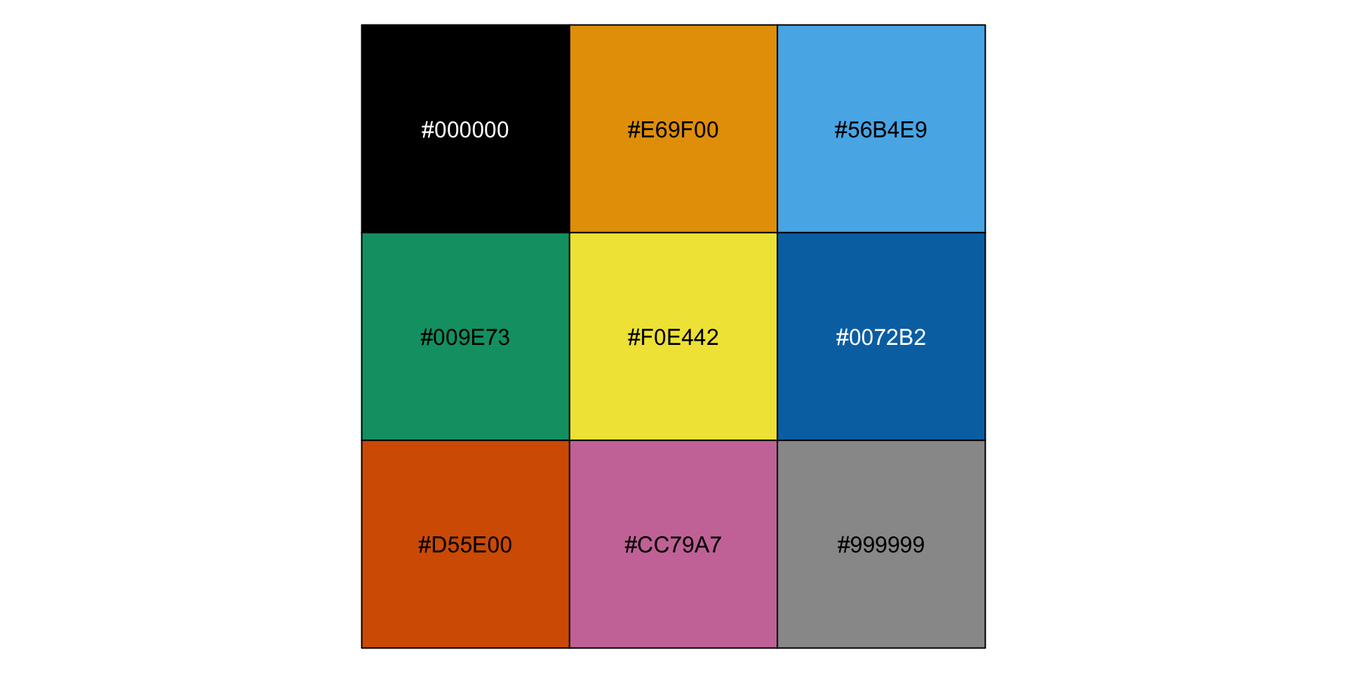
Okabe-Ito Color Palette
Resources
Color Blindness Simulator You can upload any image and in return get an image with colors that would be visible to color-blind people with specific color vision deficiency.
Okabe-Ito 2008 Color Universal Design. Color palette that is color-blind friendly.
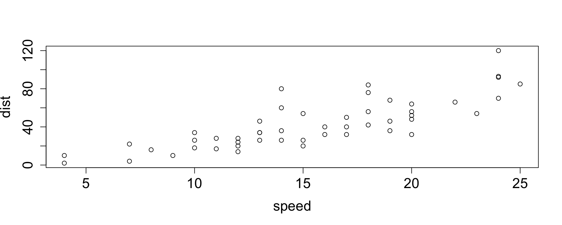
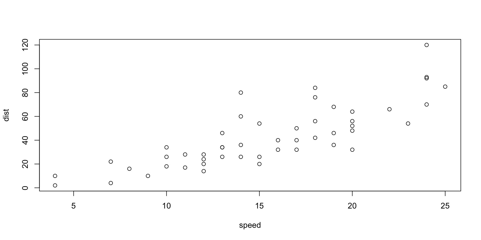
The speed of cars (mph) and the distances (ft) taken to stop
```{r}#| fig-cap: "The speed of cars (mph) and the distances (ft) taken to stop"#| fig-alt: "The scatterplot shows speed ranging from about 0 to 25 mph on the x-axis and dist ranging from 0 to 120 ft on the y-axis. There is a moderate positive linear relationship."plot(cars)```
The speed of cars (mph) and the distances (ft) taken to stop
Best Practices for Alternate Text in Data Science Context
Dr. Wanda Díaz-Merced is a Puerto Rican astronomer known for using sonification while studying stars. She is the director of the Arecibo Observatory.
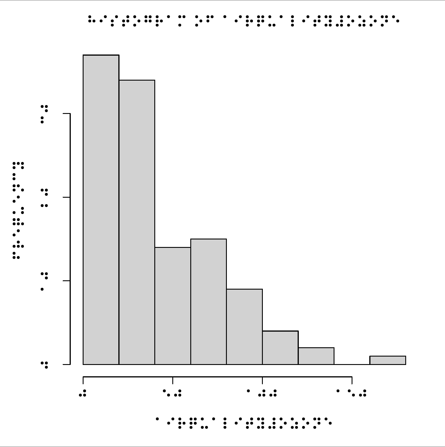
Data Tactualization
Data tactulization refers to making data visualization in a form so that it can be touchable. The video shows printing of a tactile boxplot.
Data Tactualization
library(tactileR)brl_begin(file ='tactile.pdf', pt =11, paper ='special', font='BRL')hist(airquality$Ozone)brl_end()
Different representations of data is one way of introducing accessibility to students but it is not meant to be a complete introduction to accessibility.